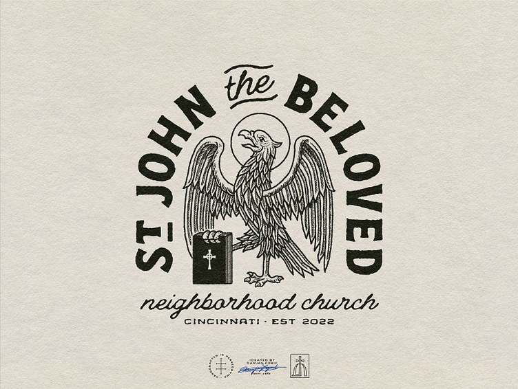
St. John the Beloved Master Logo

🏴 Brand identity for an urban, neighborhood church in Cincinnati.
St. John provides a first gospel experience for the irreligious, outsiders, and those who never saw themselves getting involved with Jesus or his church.
🦅 The client envisioned a classic, edgy logo that grabs attention and makes people wonder if St. John is a new brewery, coffee shop, or something else.
I created a combination mark based around an eagle holding the gospel to reference St. John - “the Eagle of Patmos”.
For the type, we went with a hand-drawn approach in an oval lockup.
🎨 The color palette is neutral and warm, consisting of an off-white and a soft black.


